Product Pages That Actually Convert
Design principles and UX strategies that help Canadian ecommerce brands turn browsers into buyers. Learn what works, what doesn’t, and why.
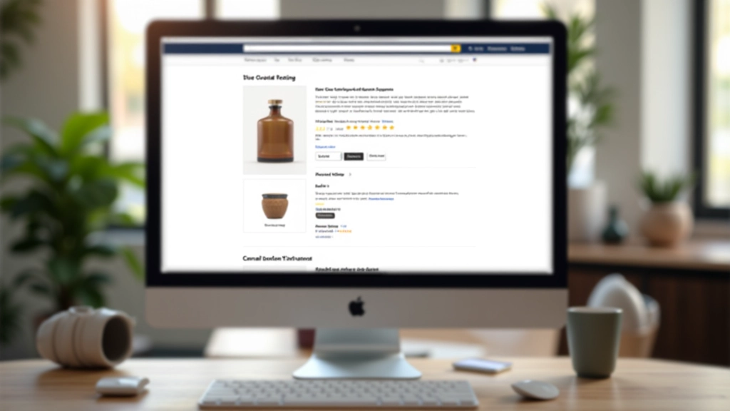
What Makes a Product Page Work
These aren’t abstract concepts. They’re specific design decisions that reduce friction and move customers toward purchase.
Visual Hierarchy
The most important information — product image, price, reviews — needs to grab attention first. Everything else supports those core elements.
Trust Signals
Real customer reviews, ratings, return policies, security badges. You’re not just selling a product — you’re proving it’s worth the risk.
Friction Reduction
Every extra click, every unclear button, every confusing step — they add up. Checkout flow optimization directly impacts your bottom line.
Mobile First
Over 60% of ecommerce traffic comes from phones. If your product page doesn’t work on mobile, you’re losing half your customers.
Clear Information
Sizing charts, material details, shipping costs, return timeframes. Customers want answers before they commit. Give them upfront.
Scarcity & Urgency
Done right, it works. Done wrong, it looks desperate. Learn how to communicate availability without resorting to fake countdown timers.
Ecommerce Product Page Design for Higher Conversions
Detailed guides on the specific design decisions that impact conversion rates for Canadian ecommerce brands.

Visual Hierarchy: Making Product Information Easy to Scan
How to organize product images, pricing, and details so customers find what they need without cognitive overload.
Read Guide
Building Trust on Product Pages: Reviews, Ratings, and Social Proof
Where to place testimonials and ratings, how many you actually need, and why authenticity matters more than volume.
Read Guide
Checkout Flow Optimization: Reducing Cart Abandonment
The specific design decisions that keep customers moving through checkout without friction. Real numbers from tested changes.
Read GuideHow Product Page Design Impacts Conversions
It’s not one big change. It’s dozens of small decisions that compound into better results.
First Impression (3 Seconds)
Your product image and headline need to stop the scroll. If someone doesn’t believe they’re in the right place, they’re gone. Layout, image quality, and typography all matter here.
Information Scanning (10-20 Seconds)
They’re looking for price, reviews, key details. Can they find these without scrolling too much? Is the information organized logically? Poor visual hierarchy loses people here.
Decision Making (30+ Seconds)
Trust signals kick in. Real reviews, return policy clarity, shipping info. They’re asking: Is this legit? Will I regret this? Can I return it? Clear answers move them toward checkout.
Checkout Execution (Variable)
Every form field, every error message, every unexpected shipping cost — they all create friction. One confusing step can kill a sale that was 90% done.
What the Data Shows
These aren’t made-up numbers. They’re from actual ecommerce platforms, conversion rate optimization studies, and real Canadian businesses testing changes on their sites.
of ecommerce abandonment happens at checkout
of customers read product reviews before buying
average time to form first impression on product page
increase in conversion from removing one form field
What Canadian Ecommerce Brands Are Saying
“We weren’t sure if redesigning our product pages would actually move the needle. After implementing better visual hierarchy and clearer trust signals, our conversion rate went from 1.8% to 2.4%. That’s not huge percentage-wise, but it translated to an extra $40,000 in monthly revenue. The specific changes — better product images, customer reviews positioned higher, and simplifying our checkout — made all the difference.”
— Sarah M., Online Fashion Retailer
“Our mobile conversion rate was abysmal. We weren’t even thinking about how the product page looked on phones. Once we redesigned for mobile first — bigger images, clearer buttons, simplified information — we saw immediate improvement. Mobile now accounts for 55% of our sales instead of 35%. That’s just good design.”
— James T., Home Goods Ecommerce
“We tested removing unnecessary form fields from checkout. It sounds simple, but we were asking for information we didn’t actually need. Cutting our checkout from 8 fields to 5 reduced abandonment by 18%. People don’t want to fill out forms — they want to buy and leave. Make it easy for them.”
— Michelle L., Electronics Seller
Why Product Page Design Matters
Most ecommerce brands focus on getting traffic. They spend thousands on ads and marketing, then put a mediocre product page in front of all those potential customers. It’s like inviting someone to your home and making them stand outside in the cold.
Your product page is where the sale actually happens. It’s where traffic converts to revenue. Small design improvements — better information organization, clearer trust signals, smoother checkout — compound into significant revenue increases. We’ve seen Canadian ecommerce businesses gain 20-40% conversion improvements by fixing the fundamentals.
This isn’t about tricks or psychological manipulation. It’s about respecting your customer’s time and making it obvious why your product is worth their money. When design gets out of the way and information becomes clear, conversions follow naturally.
Read Our Full Guides
How We Help Canadian Ecommerce Brands
Whether you’re redesigning from scratch or optimizing what you have, we provide the strategies and insights you need.
Design Audit
We review your current product pages and identify friction points — where customers are getting lost, where trust signals are weak, where checkout is breaking down. You get specific, actionable recommendations.
- Product page analysis
- Mobile experience review
- Checkout flow assessment
- Competitor comparison
- Priority recommendations
Strategy & Design
Full redesign of your product pages based on conversion optimization principles. We handle information architecture, visual hierarchy, trust signal placement, and mobile optimization. Includes testing and iteration.
- Complete redesign
- A/B testing framework
- Mobile-first approach
- Trust signal optimization
- Checkout simplification
- Ongoing optimization
Training & Consultation
Want to understand ecommerce UX so you can make better decisions internally? We provide hands-on training for your team, strategic consultation for specific challenges, and ongoing guidance.
- Team training sessions
- Strategy consultation
- Design best practices
- Implementation support
- Performance tracking
Ready to Improve Your Product Pages?
Start with our free design audit. We’ll review your current product pages, identify your biggest opportunities, and show you exactly what’s working and what isn’t. No obligation, no sales pitch.
Get Your Free Audit