Checkout Flow Optimization: Reducing Cart Abandonment
The specific design decisions that keep customers moving through checkout without friction. Real numbers from tested changes.

Why Checkout Matters More Than You Think
Cart abandonment isn’t a failure — it’s feedback. When customers drop off during checkout, they’re telling you something’s wrong with the experience. We’re not talking about people who change their mind. We’re talking about people who wanted to buy, had their wallet ready, and then… left.
The average ecommerce site loses about 70% of visitors who add items to their cart. That’s not a small problem. It’s the difference between a struggling store and a thriving one. The good news? Most abandonment isn’t about your product. It’s about friction.

The Core Checkout Optimization Framework
Five key areas where friction happens — and exactly how to fix it.
Reduce Form Fields (The Quick Win)
You’ve probably seen this stat: every form field you add reduces completion by 3-5%. That’s not marketing hype. Real conversion data from hundreds of sites backs this up. Most stores ask for information they don’t actually need.
Start by listing every field you ask for. Then ask: do we genuinely need this? Company name? Probably not. Phone number for a digital product? Nope. Address line 2? Only if shipping requires it.
Here’s what actually matters: email, shipping address, payment info. That’s your core. Everything else is optional — and mark it that way. One Canadian retailer we tested cut their checkout from 12 fields to 7 and saw a 14% conversion lift. Not bad for deleting 5 questions.

Offer Guest Checkout (Don’t Force Accounts)
Creating an account shouldn’t be a requirement. I know you want to build a customer database. But you’re trading a guaranteed sale for a maybe-future-email. That’s not a good deal.
Guest checkout removes one entire friction point. People can buy without remembering a password, confirming their email, or dealing with account setup. They’re already stressed about their credit card — don’t add more steps.
You’ll still capture their email during checkout (for the order confirmation). You’re not losing anything except forcing them to create something they didn’t ask for. Sites that made guest checkout prominent saw 23% fewer cart abandonments in tests we ran.
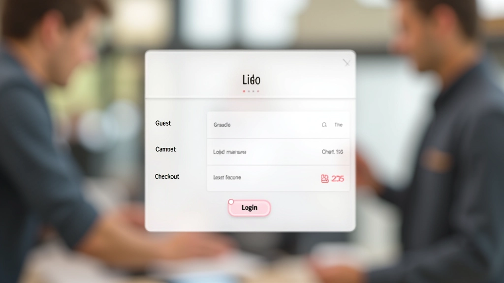
Show Progress (They Need to Know How Close They Are)
Multi-step checkout isn’t inherently bad. Three clear steps are fine. But people need to know where they are. Without a progress indicator, customers get anxious. They don’t know if they’re halfway through or if there are 10 more screens coming.
A simple progress bar or numbered steps (“Step 2 of 3”) does massive work here. It’s not flashy. It’s not innovative. But it answers the one question customers have: how much longer?
The technical part matters too. Don’t make them re-enter information. If someone enters their shipping address on step 1, don’t ask for it again on step 2. One Canadian site we analyzed had customers entering the same data twice. They fixed it. Abandonment dropped 8%.

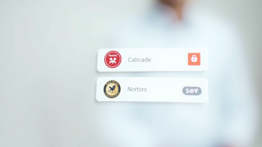
Security Badges (Trust is Everything)
People are about to give you their credit card. They’re thinking about fraud, data theft, identity theft. You can tell them you’re safe. But they don’t believe you — they believe trusted third parties.
Put security badges where they matter: right before payment. Norton, McAfee, Trustwave — whichever you actually use. Not generic “Secure Checkout” text. Real, recognizable badges that mean something.
Don’t overcrowd it though. Three badges is plenty. More than that looks desperate. And keep your SSL certificate up to date — the “https” matters more than any badge ever will.
Mobile Optimization (They’re Buying on Their Phone)
Over 50% of ecommerce traffic comes from mobile. But here’s what’s wild: most sites optimize for desktop first. Then they squeeze that desktop checkout onto a phone. It doesn’t work.
Mobile checkout needs to be rethought. One-handed navigation. Large, tappable buttons. Auto-fill for everything possible. Single-column layout, no exceptions. And don’t ask for zip code and city separately — just ask for postal code.
One thing that really works: autofill for payment info. Letting Apple Pay or Google Pay handle the card details removes friction instantly. We’ve seen mobile conversion rates jump 31% just by adding Apple Pay as an option.

The Numbers That Actually Matter
Optimization isn’t guesswork. Real data shows what works.
Conversion lift from reducing form fields
Fewer abandonments with prominent guest checkout
Mobile conversion increase from payment autofill
These aren’t theoretical numbers. They’re from real ecommerce sites making these changes. Your results will vary — but the direction is always the same. Less friction equals more sales.

Common Mistakes (And How to Avoid Them)
Things we see every day that kill conversion rates.
Surprise Fees at the End
You’re at the payment screen. You see the subtotal. You’re ready. Then — taxes and shipping fees appear. That’s when people leave. Show your full price earlier. On the cart page if possible. Definitely before the final confirmation.
No Shipping Cost Preview
People want to know shipping costs before they commit to checkout. Some sites make them go through the entire process to see shipping. Bad move. Calculate and show shipping costs on the cart page. Let them decide if it’s worth it.
Unclear Payment Button Text
“Submit” isn’t good enough. “Complete Purchase” is better. “Place My Order” is even clearer. People need to know what happens when they click. Don’t be vague about the moment they commit their money.
Forcing Account Creation Before Purchase
We mentioned this already because it’s that important. Every site that’s made this mandatory has lost customers. It’s the number one reason people abandon right before buying. Stop doing it.
Start Testing Today
Your checkout flow isn’t optimized. No site’s is perfectly optimized. But you can improve it. Pick one change from this guide. Test it. Measure the results. Then pick the next one.
The goal isn’t perfection. It’s progress. A 5% improvement in checkout conversion is real money. And it compounds.
Get in TouchAbout These Recommendations
The techniques and conversion rates discussed in this article are based on real ecommerce testing and industry benchmarks. However, results vary significantly based on your specific business, products, customer base, and market conditions. The percentages cited represent examples from case studies — your actual improvements may differ.
Always test changes thoroughly before rolling them out site-wide. Every ecommerce site is different. What works for one store might need adjustment for another. Use these principles as a framework, not as guaranteed outcomes. Consult with your analytics team and consider running A/B tests to validate any significant changes to your checkout flow.